Milestone Dashboard
OneCause had no onboarding dashboard. I designed one from zero. Nonprofits went from a blank screen to launch-ready in 60% less time.
The Fearless Fundraiser.
Nonprofit coordinators and executive directors come to OneCause ready to make an impact. They're not technical. They're mission-driven. Their first day in the product should feel like a launchpad, not a quiz.

Numbers that meant nothing yet.
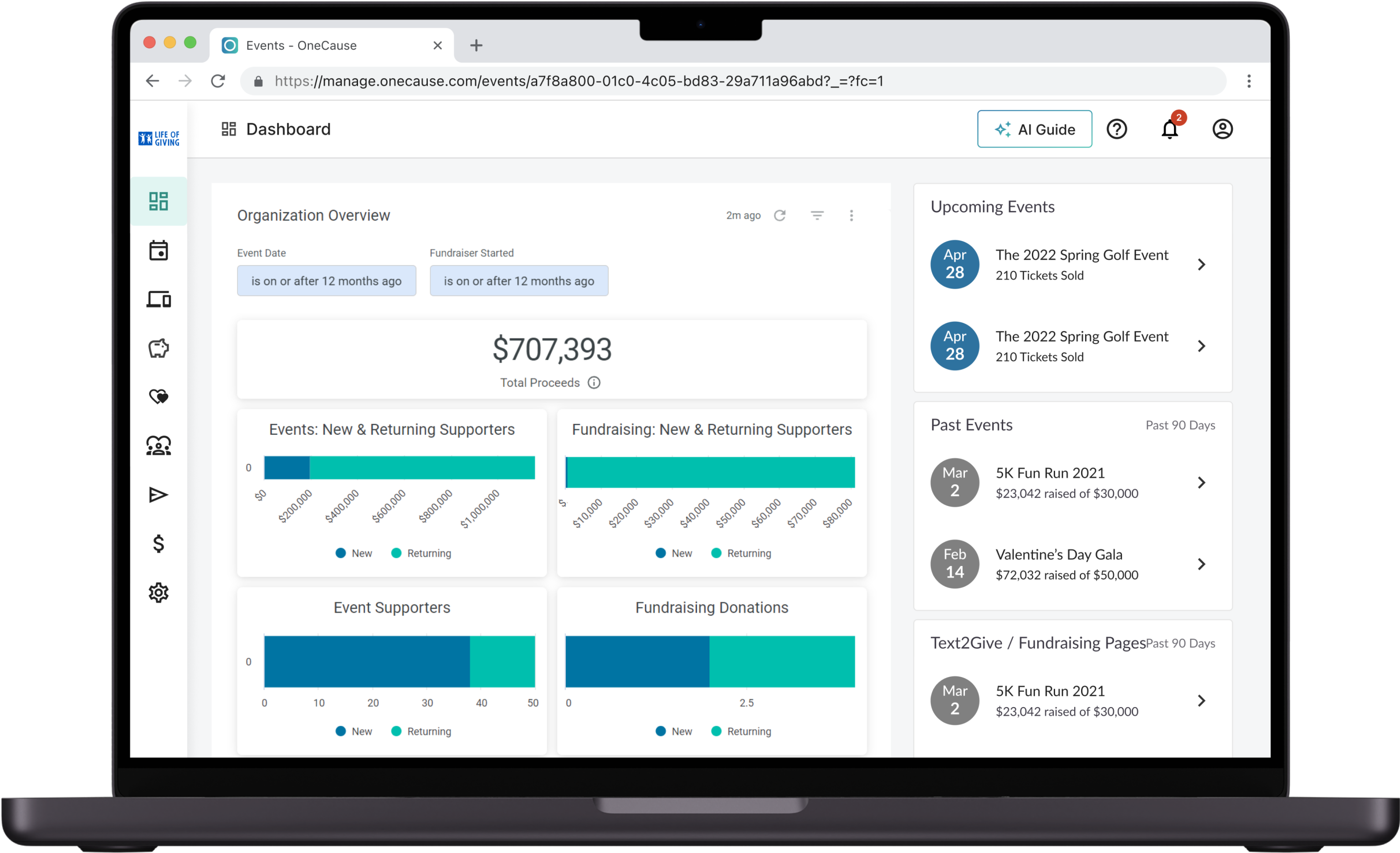
The existing dashboard threw users straight into empty graphs and zeroed-out analytics. No data, no context, no next step. It was a screen built for power users shown to people on day one.
"I logged in, saw the blank screen, and thought I'd done something wrong. I called support just to ask if I was in the right place."
— Development Director, Mid-size Nonprofit
A dashboard with one job.
The brief wasn't to redesign analytics. It was to answer one question for every new user: what do I do right now? The product needed a first-day experience that gave people direction, not data.
Research. Then deliver.
Getting it wrong, faster.
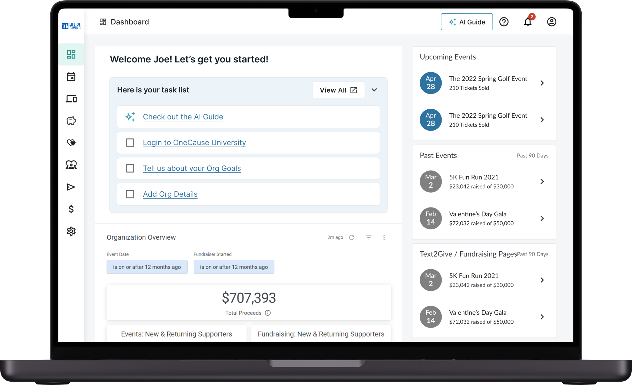
The first thought was to put a basic task list up top and push analytics to the bottom. Clean in theory. But it didn't hold up.
- No incentive to complete tasks.
- No way to track what was already done.
- Visuals didn't make the cut.
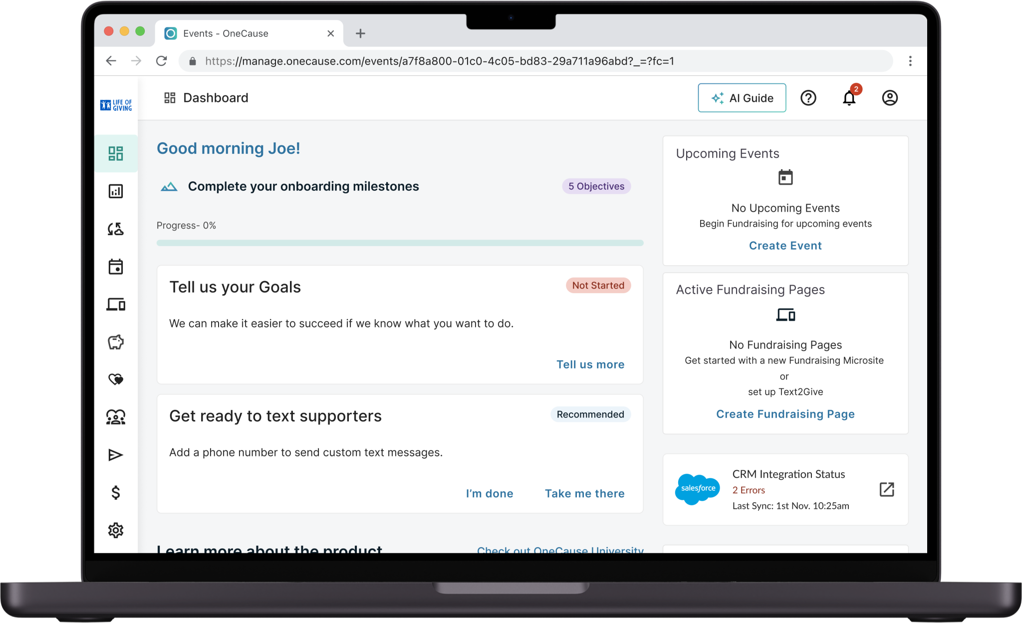
Now we're getting somewhere. Analytics moved into their own section. Milestones got more visual weight and importance. But it needed more.
- UI was too crowded.
- Key stats still weren't scannable at a glance.
- The milestone card took up way too much space.
From blank screen to first campaign.
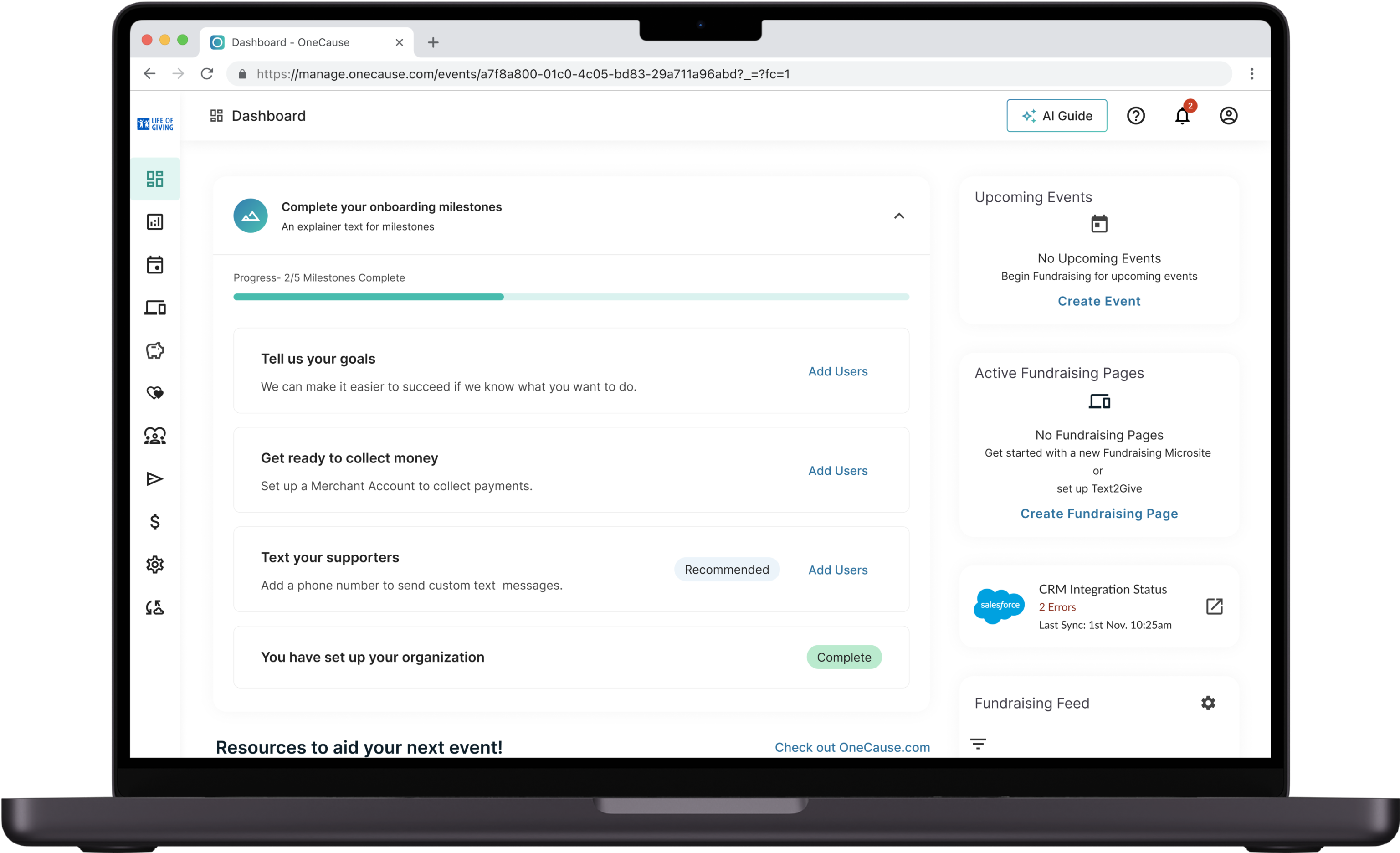
Five milestones. Each one scoped, completable, and marked done. The full platform only opens once setup is complete. No overwhelm, no guessing.
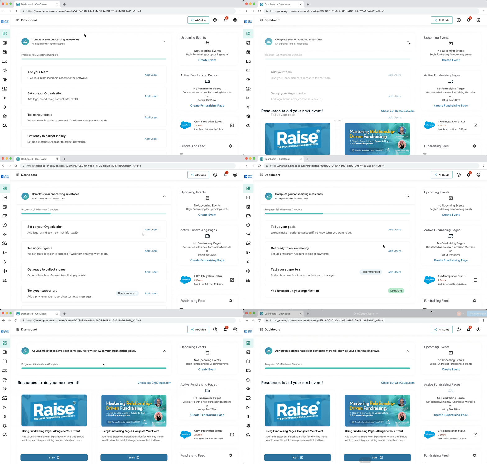
Everything they need. Right there.
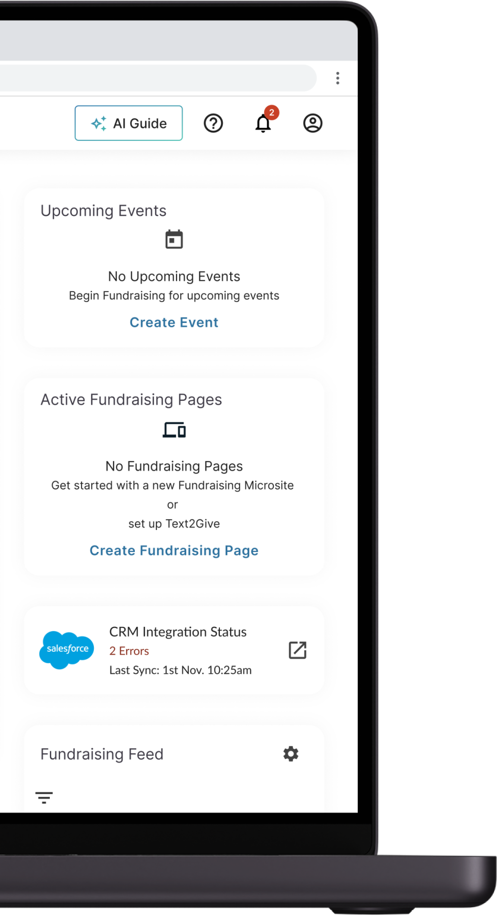
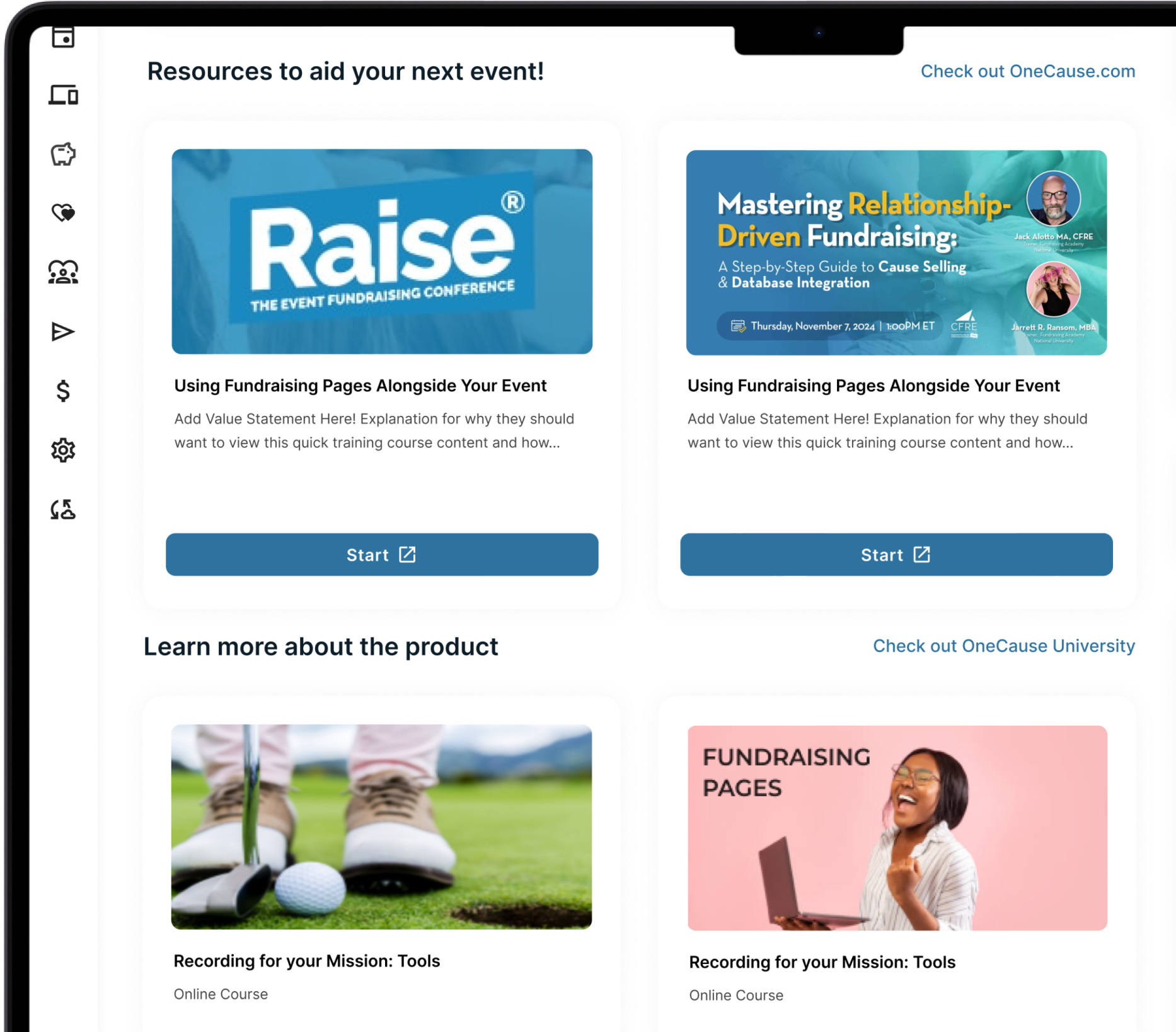
Five key milestones guide users through org setup, each with a progress status and select steps marked RECOMMENDED by OneCause. Once complete, they stack at the bottom temporarily. Alongside the milestones, the sidebar and resources give users everything they need without ever leaving the dashboard.